Showcasing creative portfolios
Glossom began as a vibrant social network, providing a platform for creatives worldwide to showcase their portfolios. My role as a fractional designer was pivotal in envisioning its transformation into an online gallery that enabled artists to sell their work through a mobile application. With a strong foundation in illustration, photography, and digital design, I spearheaded the strategic planning to align Glossom’s expansion with emerging market trends.
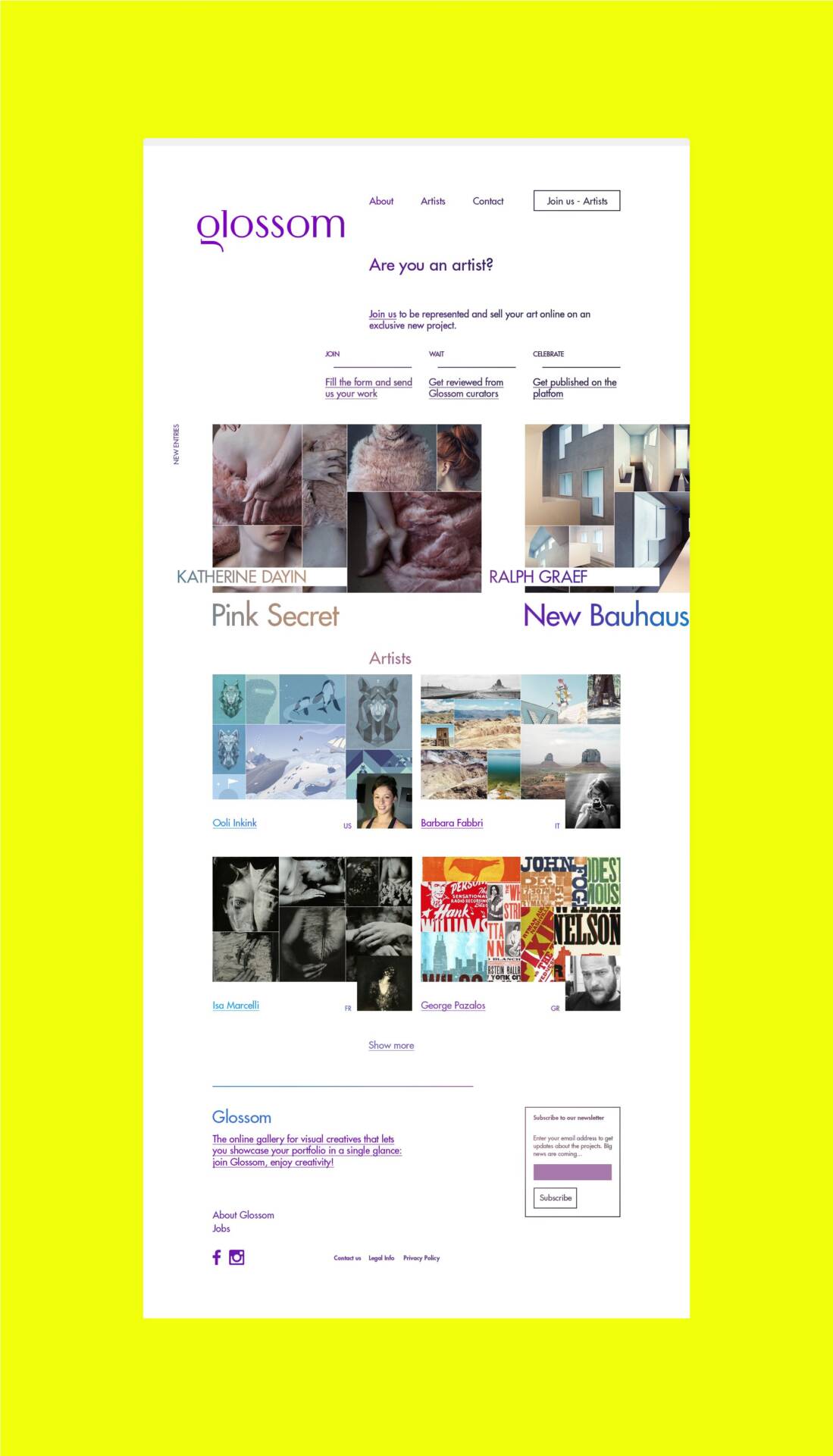
Glossom is the marketplace to find art you will love, the place to take inspiration thanks to a wide and diversified community of artists.
Piero Rivizzigno, CEO of Glossom
UX research and strategy
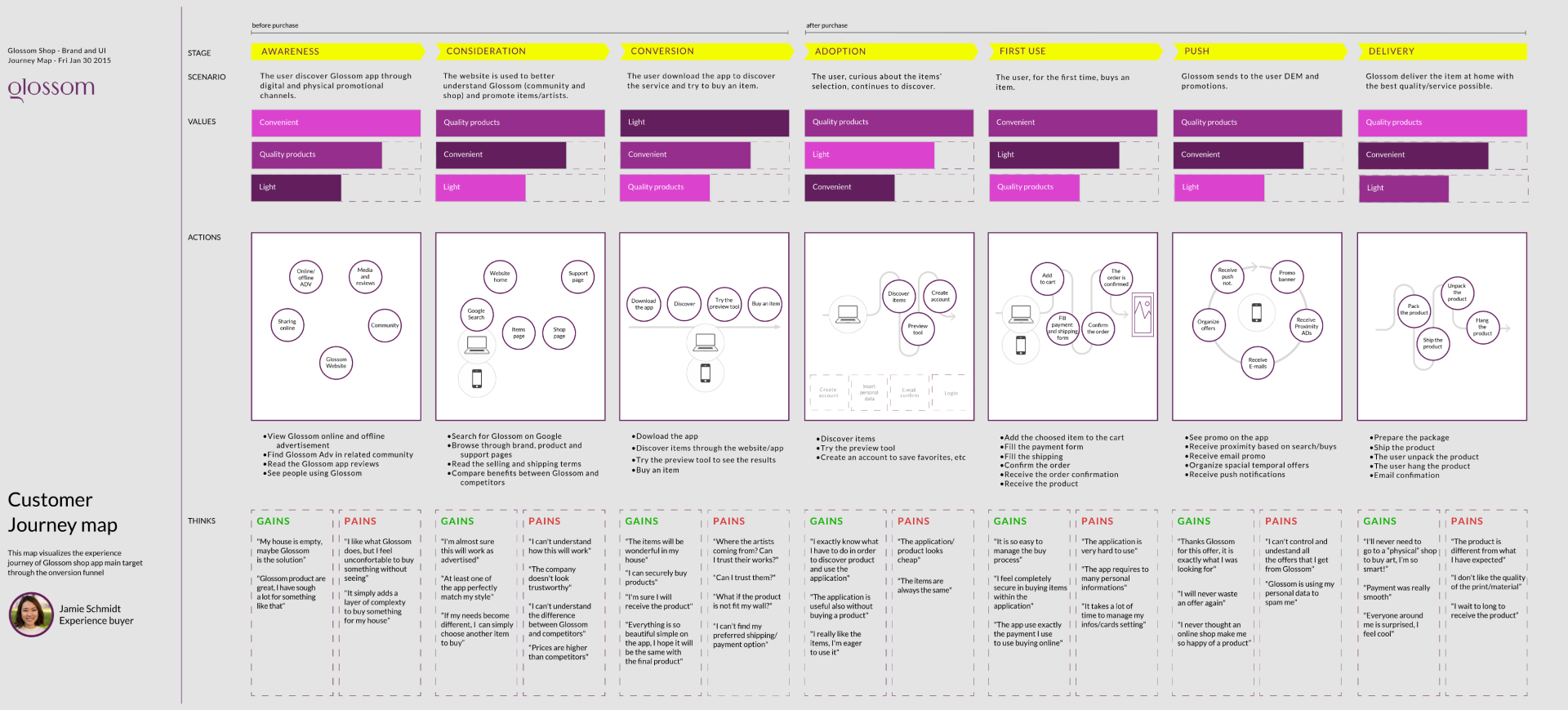
At the onset of this transformation, extensive UX research became paramount. Understanding the nuances of user preferences and industry dynamics was essential. This comprehensive research phase delved deep into user behaviors, needs, and expectations, laying the groundwork for a seamless and intuitive user experience. From identifying pain points to anticipating user interactions, every detail was meticulously analyzed to inform the app’s design.
Wireframing and prototyping
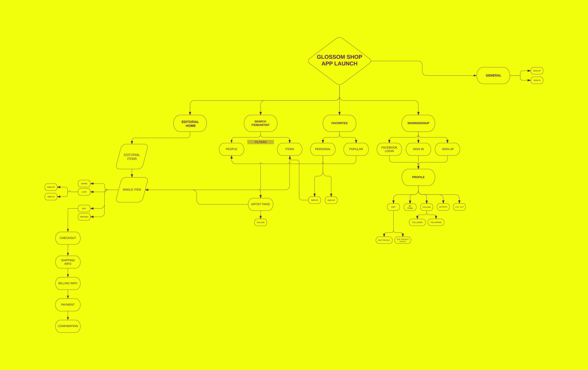
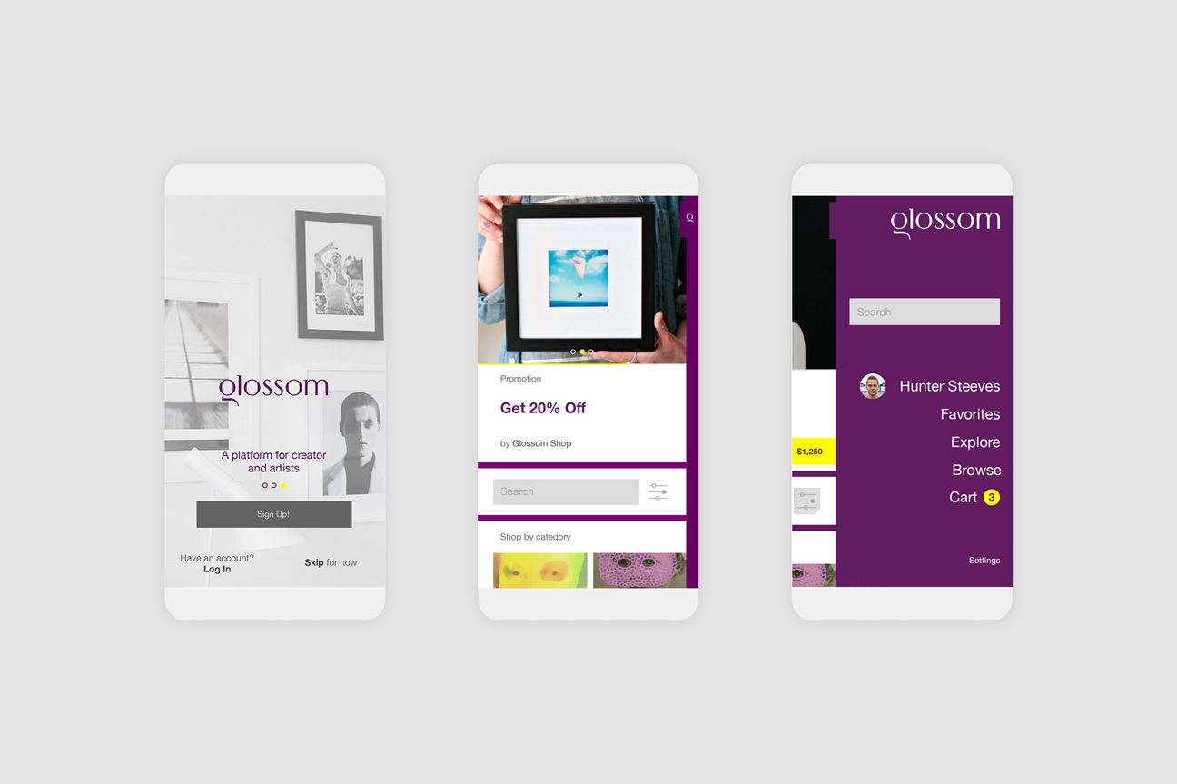
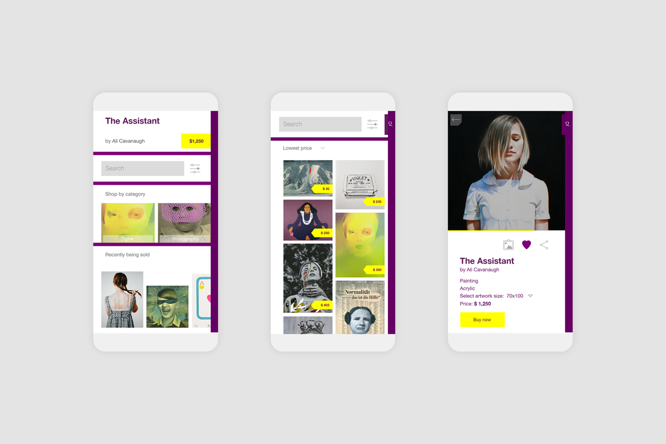
The transition from conceptualization to tangible design solutions involved strategic wireframing and prototyping. This phase was critical as it allowed for the visualization and structural planning of key components within the app interface. By meticulously outlining the app’s layout and functionality, I ensured that user journeys were intuitive and engaging. Prototypes were developed using tools like InVision, enabling stakeholders to interact with and refine the app’s features in real time.
Innovative features implementation
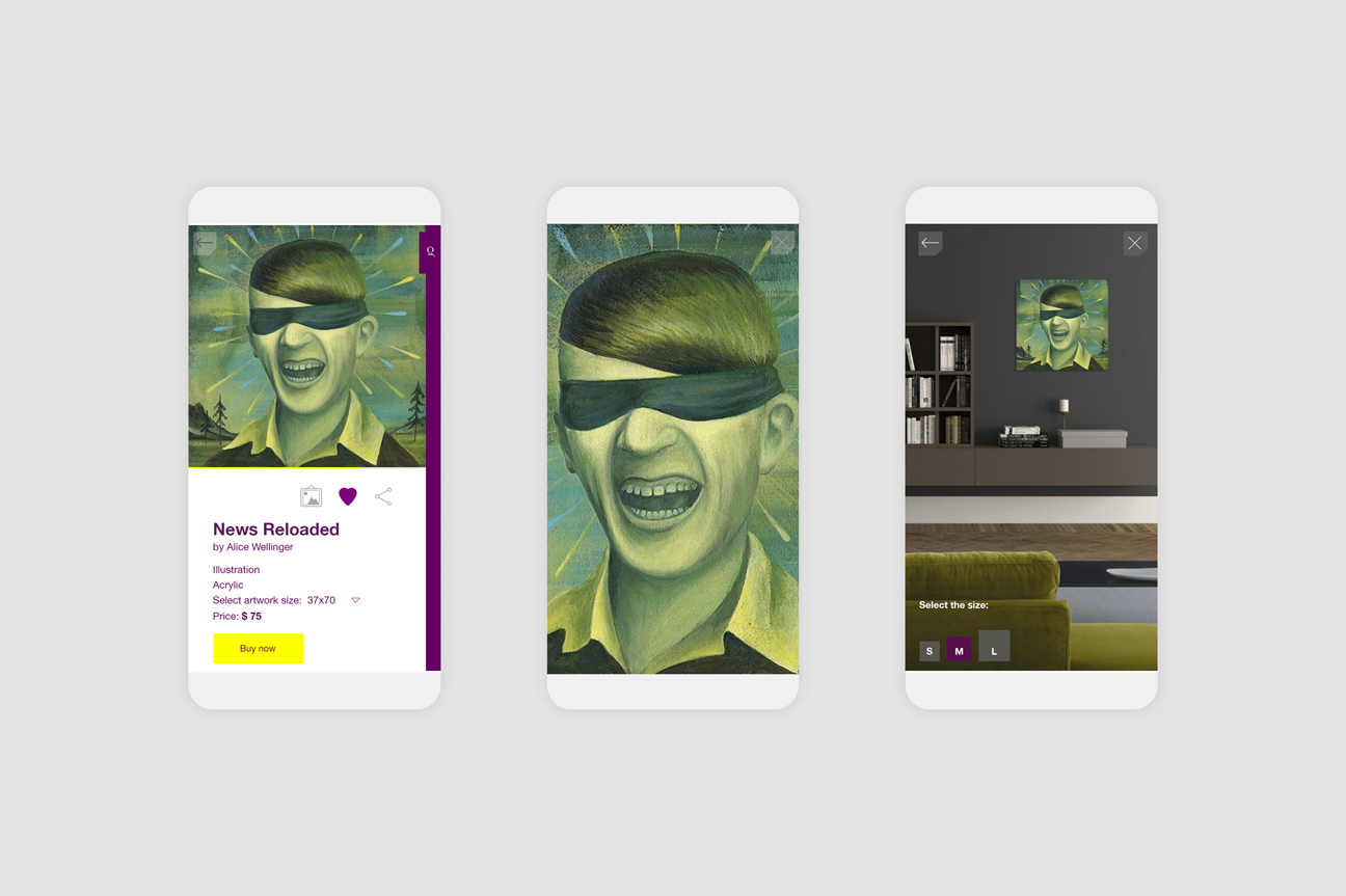
One of the standout features introduced during this phase was real-time room visualization. Users could virtually place artworks within their living spaces, offering a personalized viewing experience. This customization features not only enhanced user engagement but also aligned closely with Glossom’s vision of creating a dynamic and interactive art marketplace. The integration of such innovative functionalities underscored Glossom’s commitment to pushing creative boundaries and enhancing user satisfaction.
UI design and brand integration
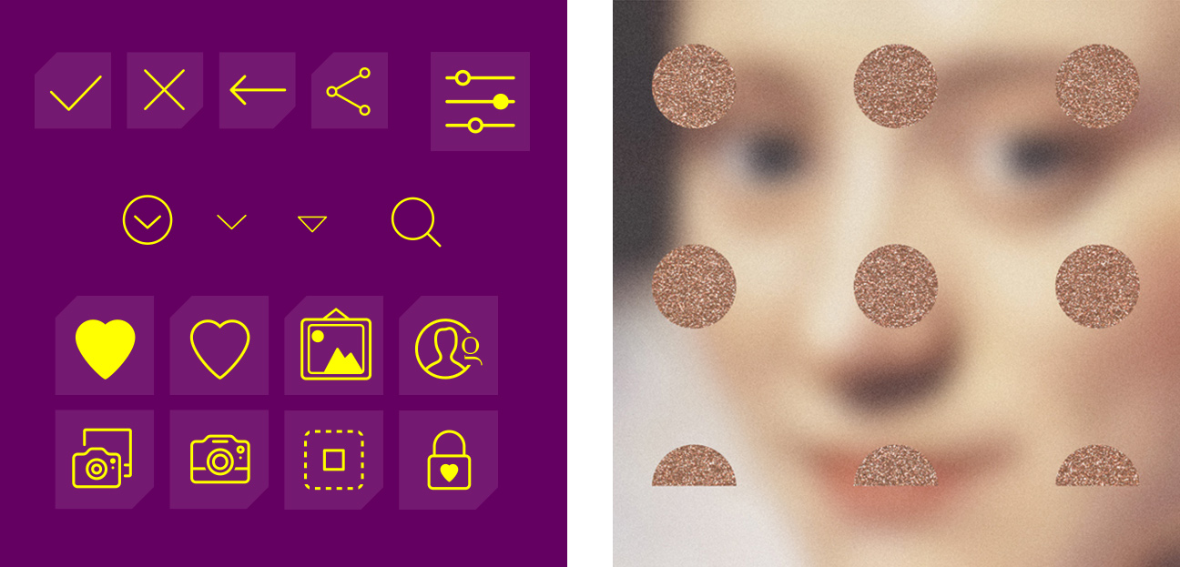
The user interface (UI) design phase was characterized by a meticulous attention to detail. Drawing inspiration from Glossom’s vibrant community and curated artist roster, the UI was crafted with a modern aesthetic. Distinctive typography and a clean layout ensured that the app interface reflected Glossom’s brand essence while providing a visually appealing and memorable user interaction. This cohesive design approach aimed to elevate user experience and foster a sense of community among artists and art enthusiasts alike.
As Glossom evolved into Arthewall, a strategic decision to expand beyond its initial scope marked a new chapter. This transition underscored the platform’s growth trajectory and its commitment to redefining visual creativity boundaries. My journey with Glossom, from conceptualization through app design and beyond, encapsulated a transformative period where my skills in illustration, photography, and mobile app development flourished. These experiences continue to shape my approach to tackling creative challenges and driving design innovation in the ever-evolving digital landscape.
Artworks by Jennis Li Cheng Tien, Ali Cavanaugh, Alice Wellinger, Chad Wys.


